

Intro
A 100% Stacked Bar chart is similar to a stacked bar chart in that categories are represented as bars and series as components of those bars. In a Stacked Bar chart, each series bar represents the percentage of the overall category to which it belongs. For example, if a category is composed of three series, one with a value of 100, one with 200, and one with 300, the first series would make up 16.6% of the category, the second would make up 33%, and the third 50%. This is similar to a pie chart, as each bar corresponds to a data slice. As with standard Bar charts, 100% stacked bar charts are available in both vertical and horizontal versions. In Vertical 100% Stacked Bar charts, the categories are stacked on top of each other; in Horizontal 100% Stacked Bar charts, the categories appear side by side. By default, the values on the y-axis appear with percentage symbols. You can change this behavior in the Chart Properties. For more information, see Formatting Values in Your Chart.Power 100% Stacked Bar Charts
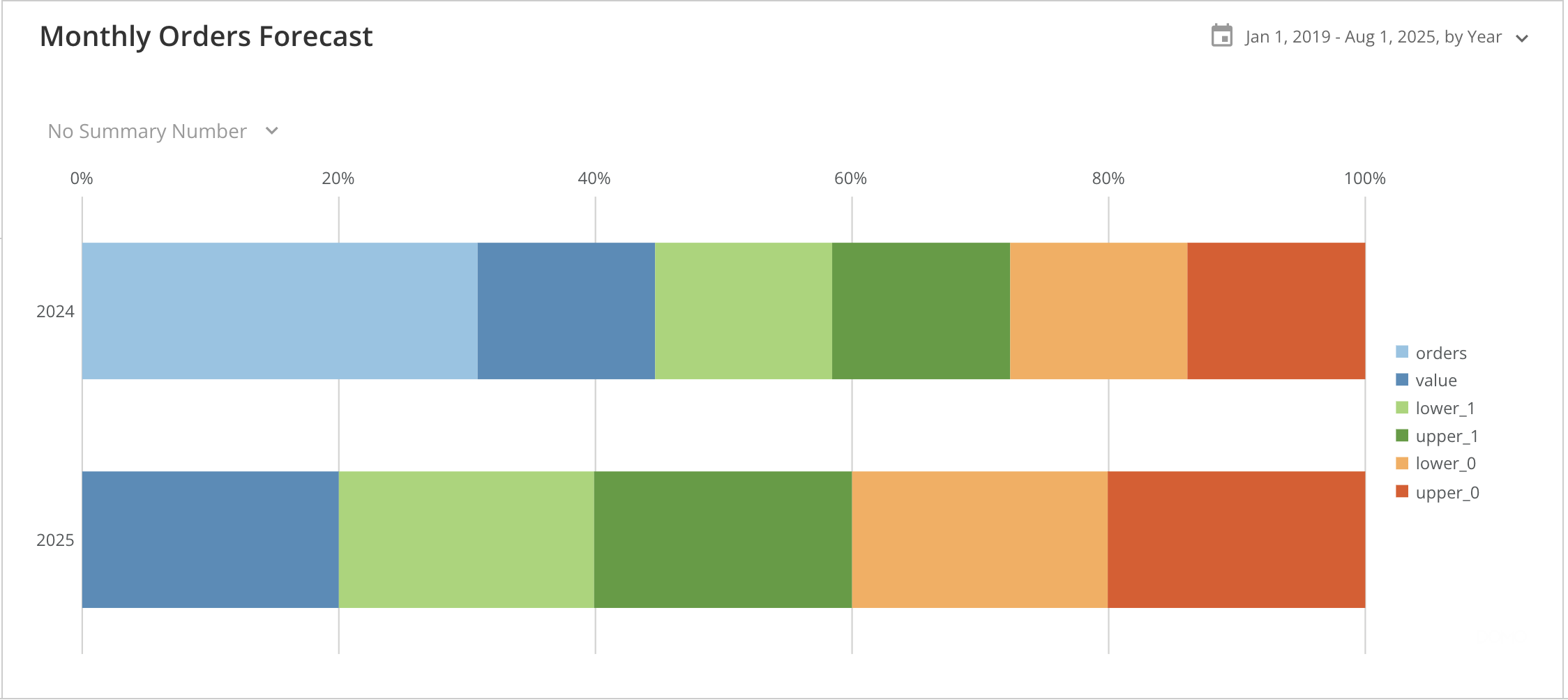
A 100% Stacked Bar chart requires at least three columns or rows from your DataSet—one for categories, one for the series in each category, and one for values. To learn more about value, category, and series data, see Understanding Chart Data. From Analyzer, you can select the columns containing the data for your 100% Stacked Bar chart. To learn more about selecting data columns, see Applying DataSet Columns to Your Chart. The following graphic shows you how the data from a typical column-based spreadsheet is converted into a vertical 100% stacked bar chart: The example shows how a monthly orders forecast DataSet is converted into a Vertical 100% Stacked Bar chart: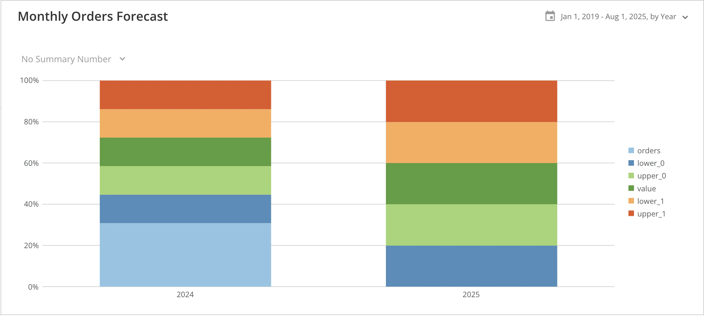
Customize 100% Stacked Bar Charts
You can customize the appearance of a 100% Stacked Bar chart by editing the Chart Properties. Unique properties of 100% Stacked Bar charts include the following: Learn more about Chart Properties.| Property | Description | Example |
|---|---|---|
| General > Sort on totals | Allows you to sort categories for most Bar and Lollipop charts by their total values, in ascending or descending order. The default sort is none. Note that the Sort each category option is unavailable when the chart has automatic time scaling applied (** Category Scale**> Never Use Time Scale). In the example, the categories are sorted by their totals in ascending order. | 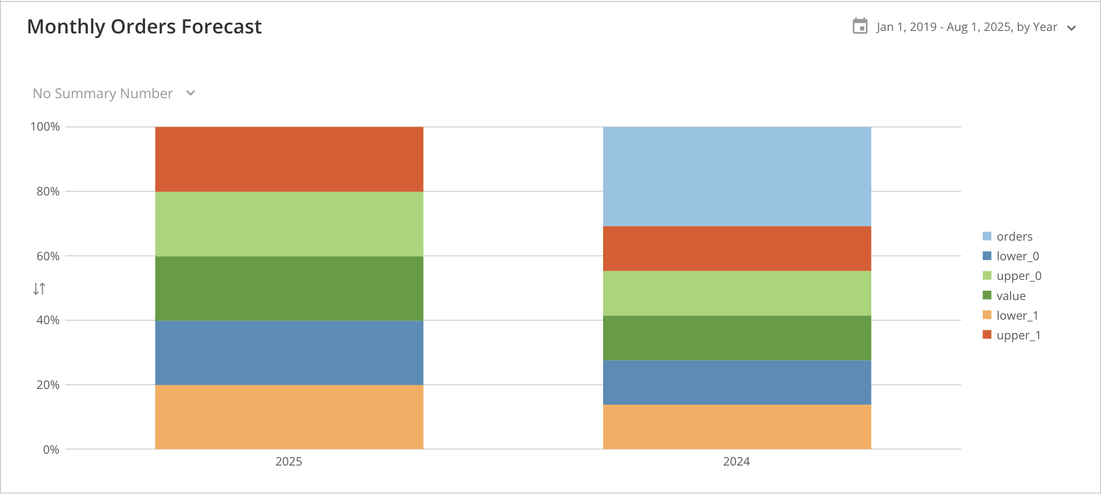 |
| General > Sort each category | Allows you to sort items in each individual category for most types of Multi-series bar and Lollipop charts. You can choose default, ascending, descending, A-Z, Z-A, or none. The default sort option is none. Note that Sort on totals is unavailable when the Value Scale> Log Scale option is checked. In the example, the bars within all categories are sorted in descending order. | 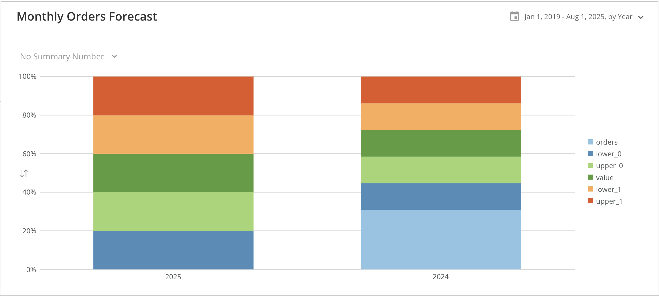 |
| Bar settings > Non-stacked interactivity | Turns off the default stacked bar chart interactivity. When you hover over any series in a stacked bar or 100% stacked bar chart, the corresponding series are highlighted and connected across the chart, as shown in the first example. If series data is missing for any stack in the chart, the highlighting is removed, and a “0” appears in the stack, as shown in the second example. By selecting Non-Stacked Interactivity, the connecting lines, highlighting, and “0” no longer appear upon hover, as shown in the third screenshot. For more information about DataSet columns, see Applying DataSet Columns to Your Chart. | 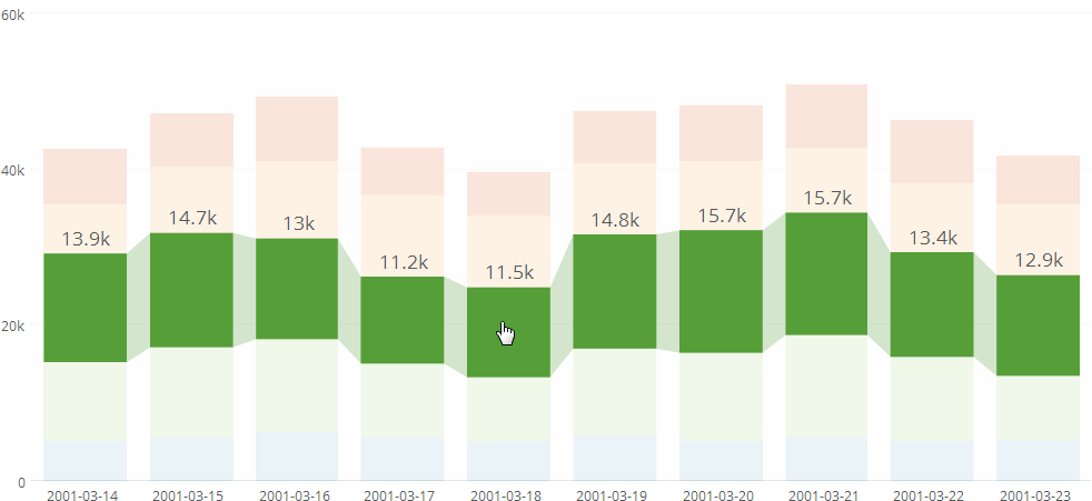 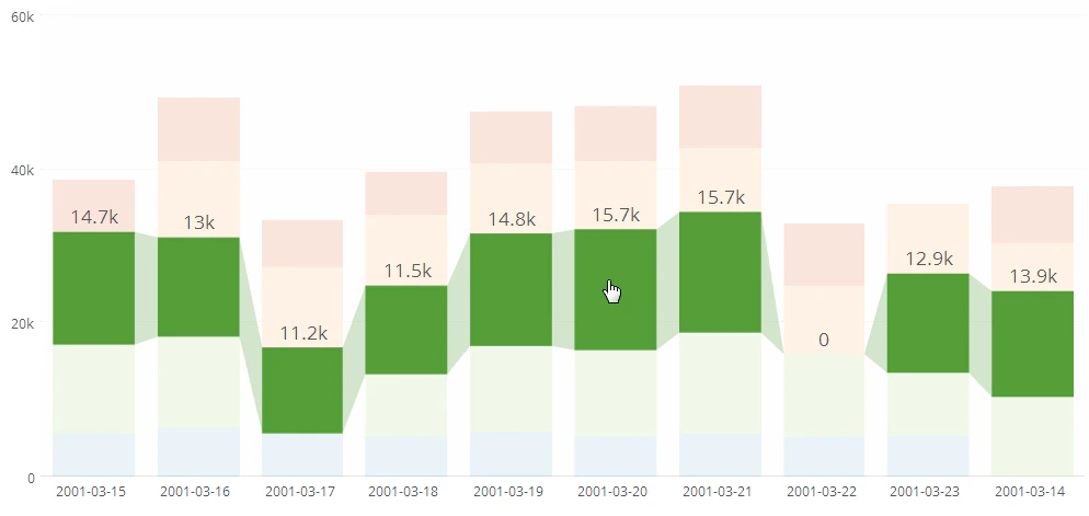 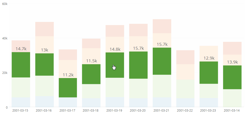 |