Intro
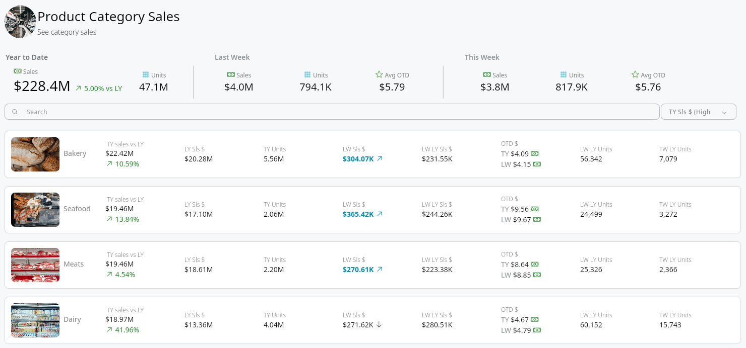
This article explains how to group and aggregate data in an app component with a Number widget, and how to use a component header to add KPIs, resize the Search and Sort buttons, and add other widgets. To place a component and power it from a DataSet first, see Create and Customize App Components in App Studio.Required Grants
To access app components, the following grants must be enabled for your role:- Edit App (App Studio) — Allows you to edit App Studio pages within App Studio.
- Edit Cards — Allows you to edit Cards in Domo.
Group and Aggregate Data in an App Component
After you power a component from a DataSet, you can group its rows by one or more columns and aggregate a column with a Number widget. This produces summarized values—such as total sales by region—directly in the component, without a Beast Mode calculation or a separate pre-aggregated DataSet.-
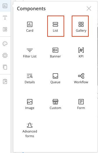
In the App Studio app editor, select Components in the left pane, then select an app component template to start with (List, Gallery, or Grid).
- After you select the template, select the power icon and choose a DataSet to power the component.
-
In the left pane, select the filter icon, then select Group by.
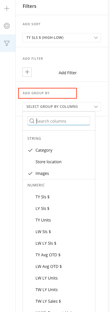
- Select one or more columns to group by. The component summarizes each unique combination of the grouped columns into a single row.
-
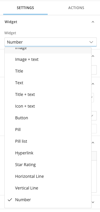
To aggregate a column, change its widget to a Number widget—a Number widget aggregates the column’s values, such as a sum or an average, while other widget types display the column’s rows. To change a widget’s type, select the widget, then in the right pane select Widget > Number.
- Save your app component.
Sort by an Aggregated Value
After you group and aggregate a component, you can sort it by an aggregated value—for example, Sales from high to low.- In the left pane, select the filter icon.
-
Select Sort at the top.
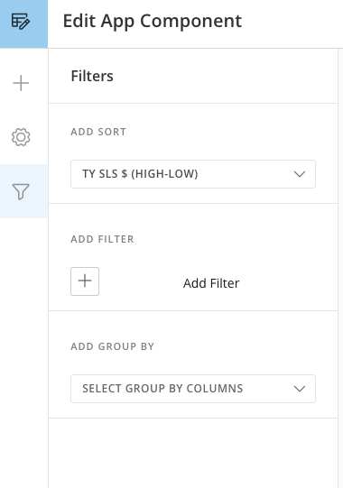
- Select the column, then select the arrow to choose the aggregation to sort by.
-
Select the aggregation and the sort order.
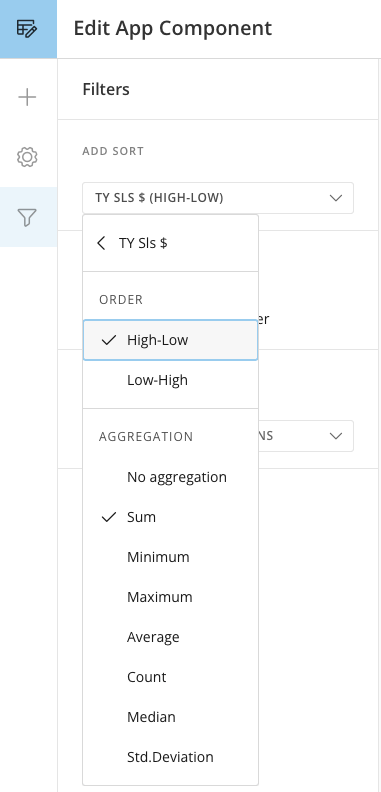
Note: You can apply one level of sort.
Add a Header to Your Component
A List, Gallery, or Grid component has a header at the top that works as a container for supporting content. Use the header to add KPIs above the component, resize the Search and Sort buttons, and add other widgets. In a component header, you can:- Add KPIs above the component — place KPI metrics above a List, Gallery, or Grid to summarize the data below. To build the KPIs, see Create a KPI Component in App Studio.
- Resize the Search and Sort buttons — adjust the width and height of the Search and Sort buttons in the header.
- Add other widgets — add more widgets to the header alongside the search and sort controls.
- In the App Studio app editor, select the component to open its configuration panel.
-
Add the KPIs, widgets, or controls you want in the header.
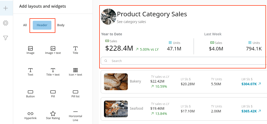
- To resize the Search and Sort buttons, select a button and adjust its width and height.
-
Save your app component.