Intro
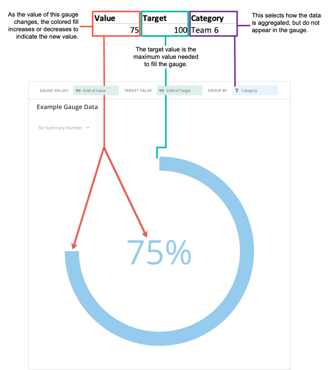
Gauges are simple charts that indicate progress towards meeting a target. A Radial Progress Gauge is similar to a thermometer that “fills in” to show how close the current value is to the goal. A Radial Progress Gauge is similar to a progress bar gauge except that it is circular. Other gauge types in Domo include single value gauges, radial gauges, face gauges, and comparative fill gauges.Powering Radial Progress Gauges
A Radial Progress Gauge requires three columns from your DataSet—the Gauge Value that contains current values, the Target Value contains the target values if you want the gauge to contain dynamic target values, (if you do not expect the target value of the gauge to change, you can specify the target in Chart Properties,) and the Group By containing categories that allows you to select how the data is aggregated, For information about value, category, and series data, see Understanding Chart Data. If multiple rows are present in your DataSet, the values in all of the rows are aggregated. Be aware that this aggregates the values for the target value column as well. For example, if your spreadsheet included two rows for “Team A” that both had a target value of 100, these would be aggregated in your chart to yield a new target value of 200. Selecting No Aggregation for either the current value or maximum does not currently work. The maximum value of a Radial Progress Gauge is automatically determined based on the current value. For example, if your current value was 80, the maximum value would be set to 100. If the current value was 155, the maximum value would be set to 200. In the Analyzer, you choose the columns containing the data for your Radial Progress Gauge. For more information about choosing data columns, see Applying DataSet Columns to Your Chart. For more information about formatting charts in the Analyzer, see Analyzer Overview. The following graphic shows you how the data from the category and value columns in a typical column-based spreadsheet is converted into a Radial Progress Gauge: