> ## Documentation Index
> Fetch the complete documentation index at: https://www.domo.com/docs/llms.txt
> Use this file to discover all available pages before exploring further.
# Apply Conditional Formatting and Conditional Rendering in App Components
export const BetaNote = ({generic = false}) =>
Note:{" "}
{generic ? "" : "This feature is in beta. "}
Beta Program participants can enable features{" "}
here. To join the
Beta Program, fill out{" "}
this form. For beta
questions or feedback, email{" "}
beta.admin@domo.com.
;
## Intro
This article explains how to apply conditional formatting to a widget in an app component, configure rules based on DataSet values, order multiple rules, and show or hide a widget with conditional rendering.
To place a component and configure its widgets first, see [Create and Customize App Components in App Studio](/docs/s/article/000005864).
***
## Required Grants
To access app components, the following grants must be enabled for your role:
* **Edit App (App Studio) —** Allows you to edit App Studio pages within App Studio.
* **Edit Cards —** Allows you to edit Cards in Domo.
Learn more about [grants](/docs/s/article/360043438973).
## Access Conditional Formatting
Where you add conditional formatting depends on what you want to change:
* **Text (Text, Number, or Pill widget) —** format the widget's text through its text box.
* **Pill color and outline —** format the Pill's color and outline through its Conditional formatting section.
* **Icon color —** format an icon in the widget's Icon section, or an icon you add in a text box editor.
### Format Text in a Widget
1. Select the widget to open its configuration panel on the right, on the **Settings** tab.
2. In the **Text** section, select the column or text you want to format.
A formatting toolbar appears below your selection.
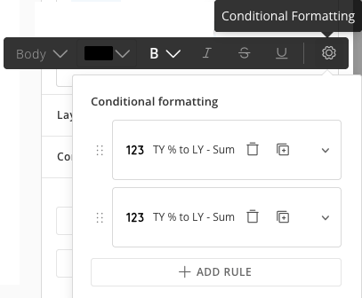
3. In the toolbar, select the conditional formatting icon (the gear icon ).
The **Conditional formatting** panel opens.
 ### Format a Pill's Color and Outline
1. Select the Pill widget to open its configuration panel on the right, on the **Settings** tab.
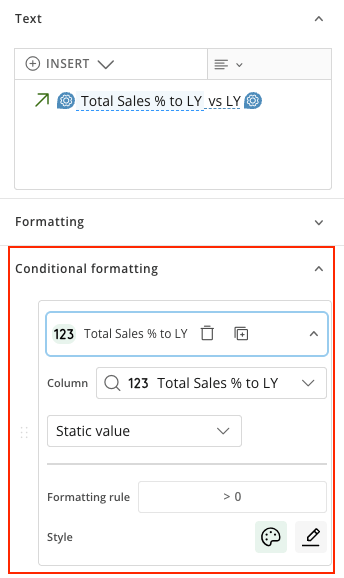
2. Go to the **Conditional formatting** section.
### Format a Pill's Color and Outline
1. Select the Pill widget to open its configuration panel on the right, on the **Settings** tab.
2. Go to the **Conditional formatting** section.
 ### Format an Icon's Color
You can conditionally format an icon in two places: the widget's **Icon** section, or an icon you add in a text box editor.
1. Select the widget to open its configuration panel on the right, on the **Settings** tab.
2. Add conditional formatting to the icon:
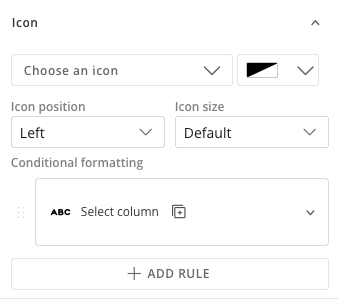
* **Icon section —** in the widget's **Icon** section, select **+ Add conditional formatting**.
### Format an Icon's Color
You can conditionally format an icon in two places: the widget's **Icon** section, or an icon you add in a text box editor.
1. Select the widget to open its configuration panel on the right, on the **Settings** tab.
2. Add conditional formatting to the icon:
* **Icon section —** in the widget's **Icon** section, select **+ Add conditional formatting**.
 * **Icon in a text box —** in the text box editor, add an icon and select it, then select **+ Add conditional formatting**.
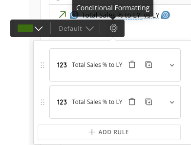 The **Conditional formatting** panel opens.
## Add a Conditional Formatting Rule
A rule evaluates a column, compares it to a value, and applies a style when the comparison is true.
1. In the **Conditional formatting** panel or section, select **+ Add rule**.
2. Select the **Column** to evaluate. You can select any column in the component's DataSet, including a Beast Mode calculation. The column does not need to be the one the widget displays—for example, you can format a City value based on a Sales column.
3. Choose how to compare the column:
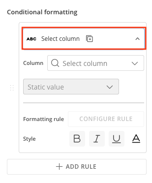
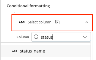
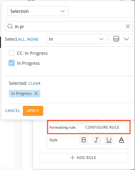
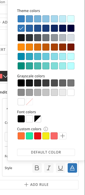
* **Static value —** compare the column to a fixed value. For example, when Status is In Progress, apply the style. The full flow, start to finish:
The **Conditional formatting** panel opens.
## Add a Conditional Formatting Rule
A rule evaluates a column, compares it to a value, and applies a style when the comparison is true.
1. In the **Conditional formatting** panel or section, select **+ Add rule**.
2. Select the **Column** to evaluate. You can select any column in the component's DataSet, including a Beast Mode calculation. The column does not need to be the one the widget displays—for example, you can format a City value based on a Sales column.
3. Choose how to compare the column:
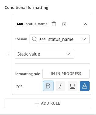
* **Static value —** compare the column to a fixed value. For example, when Status is In Progress, apply the style. The full flow, start to finish:
 * **Column —** compare the column to the value in another column. For example, when this year's sales are greater than or equal to last year's sales.
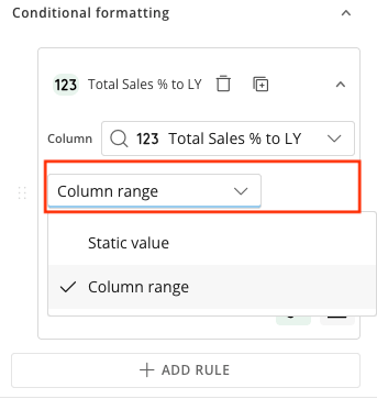
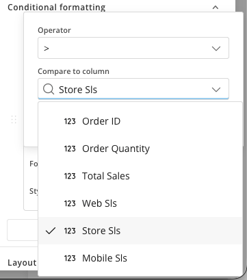 4. Select **Configure rule**, then set the operator and the comparison. For a static value, enter or choose the value. For a column, select the column to compare against. The available operators depend on the column type (see [Operators by Column Type](#operators-by-column-type) below).
5. Set the **Style** to apply when the rule is true. For text, choose Bold, Italic, Underline, or text color. For a Pill, choose the Pill color or Pill outline. For an icon, choose the icon color.
6. Save the widget.
The component preview updates to reflect the rule.
**Note:** To evaluate or compare against a column the widget doesn't display, add that column to the component first. Only columns added to the component are available to a rule.
## Supported Widgets and Styles
Style colors come from the App Theme palette, including any custom colors you add to the theme.
| Widget | What you can format | Where you configure it |
| ------ | ------------------------------------------------ | ----------------------------------------- |
| Text | Text style (Bold, Italic, Underline, text color) | The widget's text box |
| Number | Text style (Bold, Italic, Underline, text color) | The widget's text box |
| Pill | Text style (Bold, Italic, Underline, text color) | The widget's text box |
| Pill | Pill color, Pill outline | The Pill's Conditional formatting section |
| Icon | Icon color | The widget's Icon section |
## Operators by Column Type
The operators available in a rule depend on the type of the evaluation column.
| Column type | Available operators |
| ----------- | ------------------------------------------------------------------------------------------------------------------ |
| Text | contains, does not contain, starts with, does not start with, ends with, does not end with, is, is not, in, not in |
| Numeric | is greater than or equal to, is greater than, is less than, is less than or equal to, is between, is |
| Date | is greater than or equal to, is greater than, is less than, is less than or equal to, is between, is |
## Order Multiple Rules
You can add more than one rule to a single widget. Rules are evaluated from top to bottom, and the first rule whose comparison is true is applied—later rules are skipped for that row.
1. Add each rule you want to apply.
2. Drag the rules into the order you want them evaluated.
4. Select **Configure rule**, then set the operator and the comparison. For a static value, enter or choose the value. For a column, select the column to compare against. The available operators depend on the column type (see [Operators by Column Type](#operators-by-column-type) below).
5. Set the **Style** to apply when the rule is true. For text, choose Bold, Italic, Underline, or text color. For a Pill, choose the Pill color or Pill outline. For an icon, choose the icon color.
6. Save the widget.
The component preview updates to reflect the rule.
**Note:** To evaluate or compare against a column the widget doesn't display, add that column to the component first. Only columns added to the component are available to a rule.
## Supported Widgets and Styles
Style colors come from the App Theme palette, including any custom colors you add to the theme.
| Widget | What you can format | Where you configure it |
| ------ | ------------------------------------------------ | ----------------------------------------- |
| Text | Text style (Bold, Italic, Underline, text color) | The widget's text box |
| Number | Text style (Bold, Italic, Underline, text color) | The widget's text box |
| Pill | Text style (Bold, Italic, Underline, text color) | The widget's text box |
| Pill | Pill color, Pill outline | The Pill's Conditional formatting section |
| Icon | Icon color | The widget's Icon section |
## Operators by Column Type
The operators available in a rule depend on the type of the evaluation column.
| Column type | Available operators |
| ----------- | ------------------------------------------------------------------------------------------------------------------ |
| Text | contains, does not contain, starts with, does not start with, ends with, does not end with, is, is not, in, not in |
| Numeric | is greater than or equal to, is greater than, is less than, is less than or equal to, is between, is |
| Date | is greater than or equal to, is greater than, is less than, is less than or equal to, is between, is |
## Order Multiple Rules
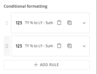
You can add more than one rule to a single widget. Rules are evaluated from top to bottom, and the first rule whose comparison is true is applied—later rules are skipped for that row.
1. Add each rule you want to apply.
2. Drag the rules into the order you want them evaluated.
 3. Save the widget.
**Tip:** Put your most specific rule first. Because the first matching rule wins, a broad rule placed above a specific one prevents the specific one from ever applying.
When no rule matches a row, the widget uses its default style from the component theme and static style settings.
## Show or Hide a Widget with Conditional Rendering
Conditional rendering shows or hides a widget based on a column's value. Configure it in the **Conditional Rendering** section of the widget's **Settings** tab. It uses the same rules as conditional formatting, but instead of applying a style, each rule shows or hides the widget—for example, show an icon only when a Status column is Critical.
1. Select the widget to open its configuration panel on the right, on the **Settings** tab.
2. Go to the **Conditional Rendering** section.
3. Set **Default** to **Show** or **Hide**—how the widget appears when no rule matches.
3. Save the widget.
**Tip:** Put your most specific rule first. Because the first matching rule wins, a broad rule placed above a specific one prevents the specific one from ever applying.
When no rule matches a row, the widget uses its default style from the component theme and static style settings.
## Show or Hide a Widget with Conditional Rendering
Conditional rendering shows or hides a widget based on a column's value. Configure it in the **Conditional Rendering** section of the widget's **Settings** tab. It uses the same rules as conditional formatting, but instead of applying a style, each rule shows or hides the widget—for example, show an icon only when a Status column is Critical.
1. Select the widget to open its configuration panel on the right, on the **Settings** tab.
2. Go to the **Conditional Rendering** section.
3. Set **Default** to **Show** or **Hide**—how the widget appears when no rule matches.
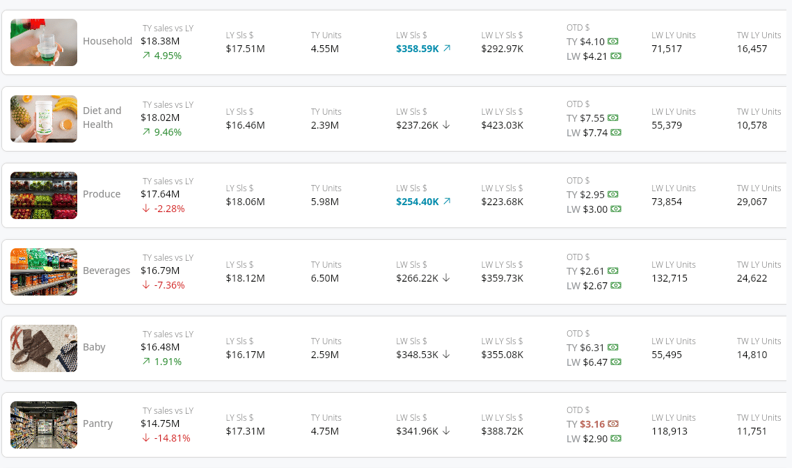 4. Select **+ Add rule**, then build the rule as you would a conditional formatting rule: select the **Column**, choose a static value or column, and select **Configure rule** to set the operator and comparison.
5. Set **Visibility** to **Show** or **Hide**—what happens to the widget when the rule is true.
6. Save the widget.
To show an icon only when a value is critical, set **Default** to **Hide**, add a rule where the Status column is Critical, and set **Visibility** to **Show**.
## FAQ
Yes. The evaluation column does not need to match the column the widget displays. For example, a Text widget showing a customer name can be formatted based on a "Days Past Due" column.
Null and empty values are evaluated literally. A null value does not match an "is" comparison against a non-null value. To target empty values, use "is" with an empty value.
Yes. Conditional formatting persists when app content is exported to PDF through Report Builder. The PDF reflects the same formatting as the live app at the time of export.
Conditional formatting evaluates the rows a viewer can see after PDP filtering is applied, so no special handling is required.
4. Select **+ Add rule**, then build the rule as you would a conditional formatting rule: select the **Column**, choose a static value or column, and select **Configure rule** to set the operator and comparison.
5. Set **Visibility** to **Show** or **Hide**—what happens to the widget when the rule is true.
6. Save the widget.
To show an icon only when a value is critical, set **Default** to **Hide**, add a rule where the Status column is Critical, and set **Visibility** to **Show**.
## FAQ
Yes. The evaluation column does not need to match the column the widget displays. For example, a Text widget showing a customer name can be formatted based on a "Days Past Due" column.
Null and empty values are evaluated literally. A null value does not match an "is" comparison against a non-null value. To target empty values, use "is" with an empty value.
Yes. Conditional formatting persists when app content is exported to PDF through Report Builder. The PDF reflects the same formatting as the live app at the time of export.
Conditional formatting evaluates the rows a viewer can see after PDP filtering is applied, so no special handling is required.